Top Burger’s transformation now connects the full customer journey:
a brand-new website with an easy online checkout, original product
photography, social content, daily Stories, in-store television
boards, and a redesigned printed menu. Mario Creative brought every
piece together with a bold, simple visual system that keeps the food
at the center.
Client
Top Burger
Industry
Food & hospitality
Services
Website design & development · Product photography · Brand
refresh · Social content · Digital menu boards · Printed menu
A customer might discover Top Burger through its website or
Instagram, place an order online, or walk straight up to the
counter. The opportunity was to make every experience feel
connected—and give the food a clear, recognizable presentation
wherever people encountered it.
02 / The approach
Build one clear customer journey.
We created a bold, streamlined website around original product
photography and simple ordering, then carried the same visual
direction into the printed menu, television boards, videos, daily
Stories, and graphic posts.
A brand-new website. Designed around the appetite.
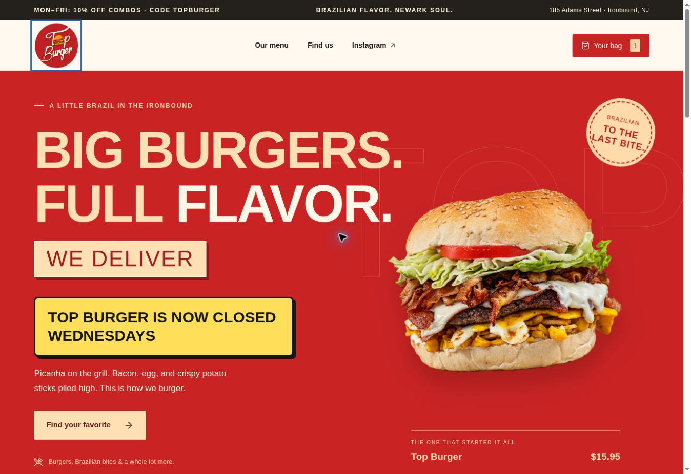
The new Top Burger website turns a large, varied menu into a focused
digital experience. Bold typography creates instant personality,
original product photography makes each choice feel tangible, and a
simple ordering path keeps the experience fast from the first craving
to checkout.
Oversized headlines, strong contrast, and tightly framed food
photography give the restaurant a confident identity. The design
feels energetic and unmistakably Top Burger without making the
menu difficult to navigate.
02 / Color system
Warm, hungry, and familiar.
Top Red#C72424Warm Cream#FFF9EFToast Gold#FFE0B5Charcoal#25221E
Red creates appetite and urgency, cream keeps the interface warmer
than pure white, gold adds a toasted food-inspired accent, and
charcoal gives text reliable contrast.
03 / Typography
Impact meets everyday clarity.
Impact and Arial Narrow create the loud, condensed display
headlines associated with classic burger shops and street signage.
Arial and Helvetica handle navigation, descriptions, pricing, and
checkout because they remain clean and readable at every size.
04 / Responsive decisions
The same personality, fitted to every screen.
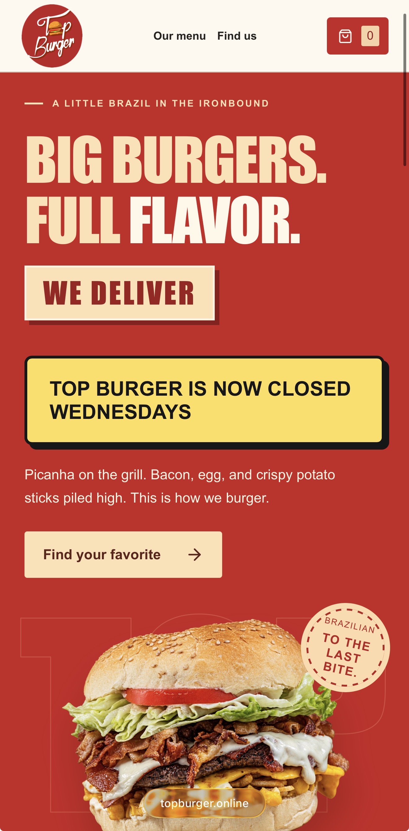
Desktop uses scale and generous space to create impact. Mobile
stacks the story vertically, keeps the menu and cart within easy
reach, and prioritizes large tap targets so customers can browse
and order comfortably with one hand.
From craving to checkout.
A simpler ordering path
01
Browse
Clear categories reduce the work of exploring a large menu.
02
Choose
Product photography, concise descriptions, and visible prices
support quick decisions.
03
Order
The cart keeps item editing, promo codes, pickup or delivery,
totals, and payment in one flow.
Easy ordering
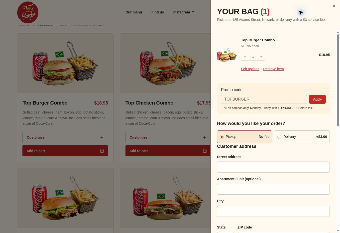
A real cart. A clear path to payment.
Customers can edit their order, choose pickup or delivery, apply a
promo code, review taxes and totals, and continue to secure
payment—all without leaving the website.
Customer dashboard
Every order. One simple place.
The customer dashboard gives returning guests a clear place to
follow active orders, review previous purchases, and manage their
ordering details. It extends the simple checkout experience beyond
payment and makes repeat ordering easier.
Track current order status
Review order history and totals
Quickly reorder familiar favorites
Manage saved customer details
My ordersCustomer account
ACTIVE ORDER#1048
Preparing
Top Burger Combo · Pickup
$21.95
Order historyView all
SEP 12#1016
Completed
Picanha Burger · Delivery
$18.50
SEP 03#982
Completed
Top Hot Dog · Pickup
$14.95
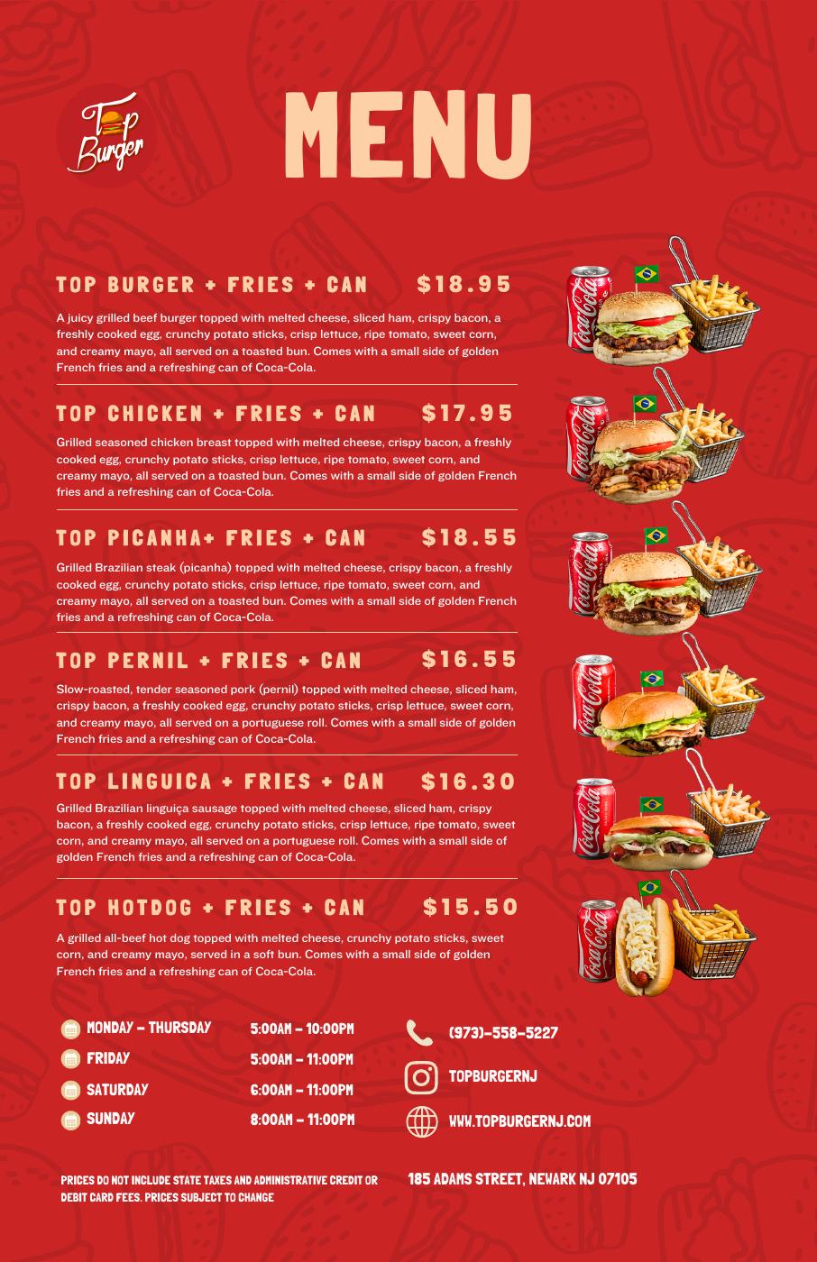
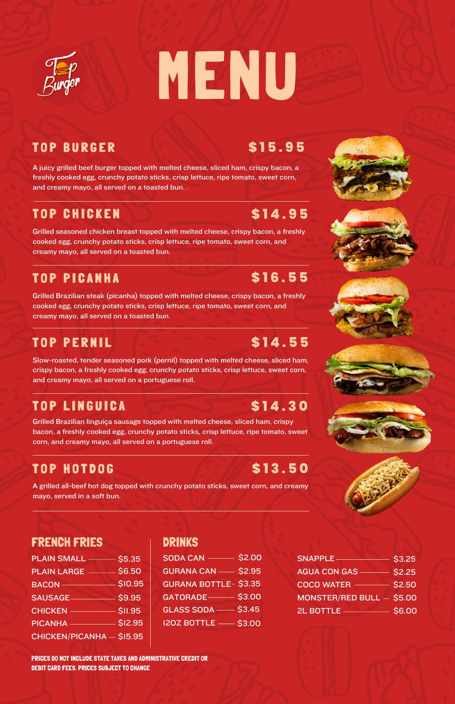
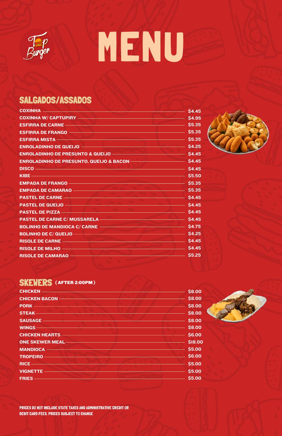
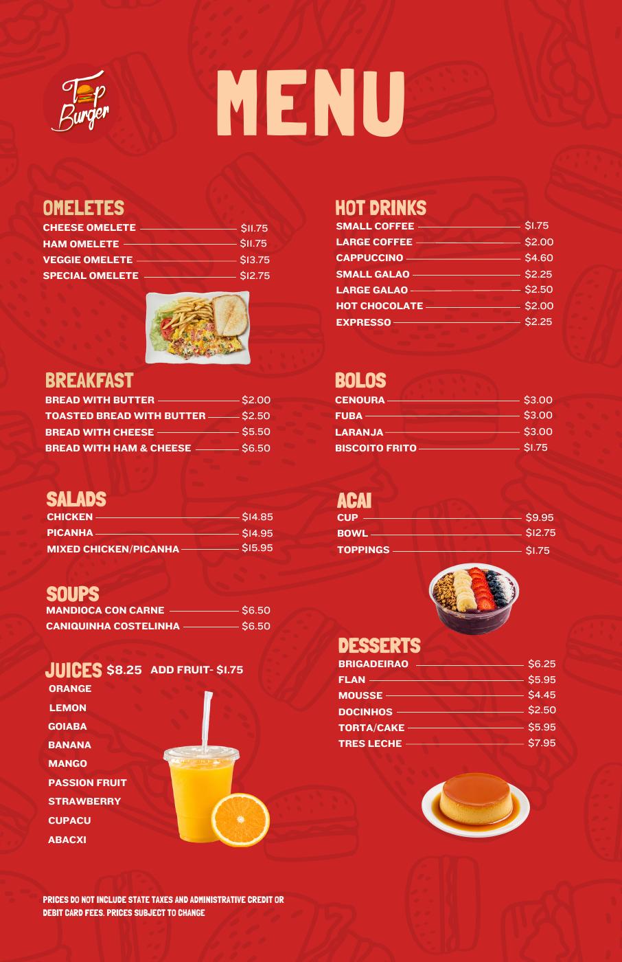
A brand-new menu. The same visual language.
11 × 17 inch printed menu
A redesigned four-page menu brings the food photography, bold category
headings, and brand colors together in print. It completes the
connection between what customers see in the feed, on screen, and at
the table.
Portfolio examples. Menu prices and availability may have changed.
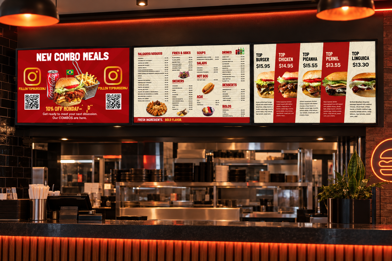
The brand. On the big screen.
Television menu boards
Live digital menu system · Three-screen restaurant installation
Custom digital boards bring the refreshed look into the restaurant.
Animated promotions sit alongside organized menu categories, clear
pricing, and product photography across five screen designs.
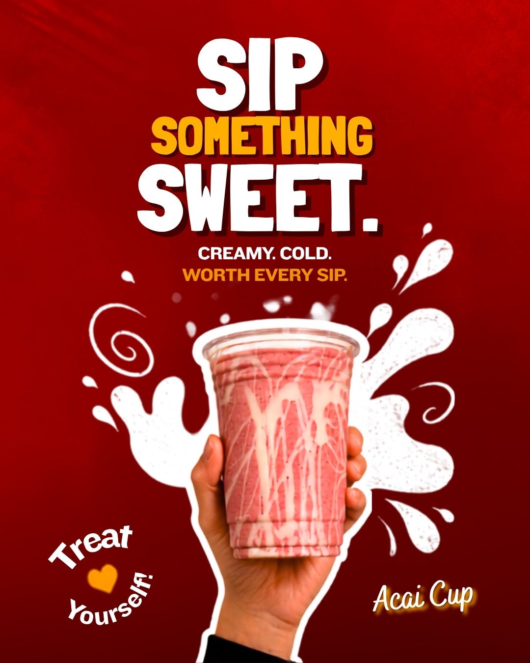
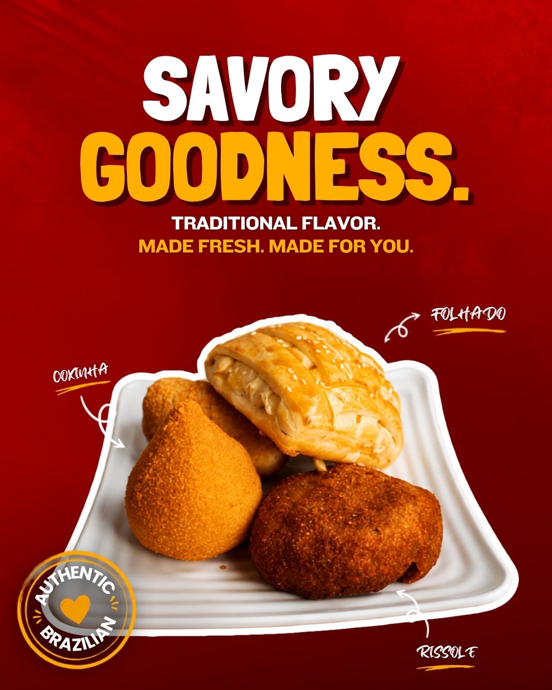
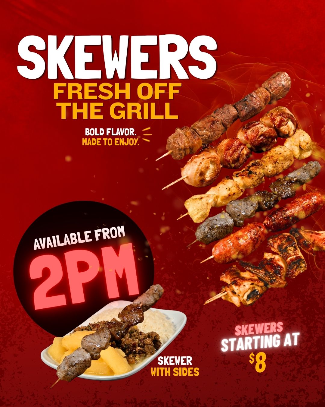
Alongside feed posts and videos, we created custom Stories for daily
posting. Delivery, breakfast, combos, and skewers each get their own
animated feature, keeping Top Burger’s menu and services visible
throughout the week.
Deep red backgrounds, oversized white headlines, and yellow accents
connect the posts. Product photography anchors each layout, while
cutout edges and playful details give each menu item its own moment.
Sip something sweetSavory goodnessFresh off the grill
Portfolio examples. Offers and availability shown in the creative may
have changed.
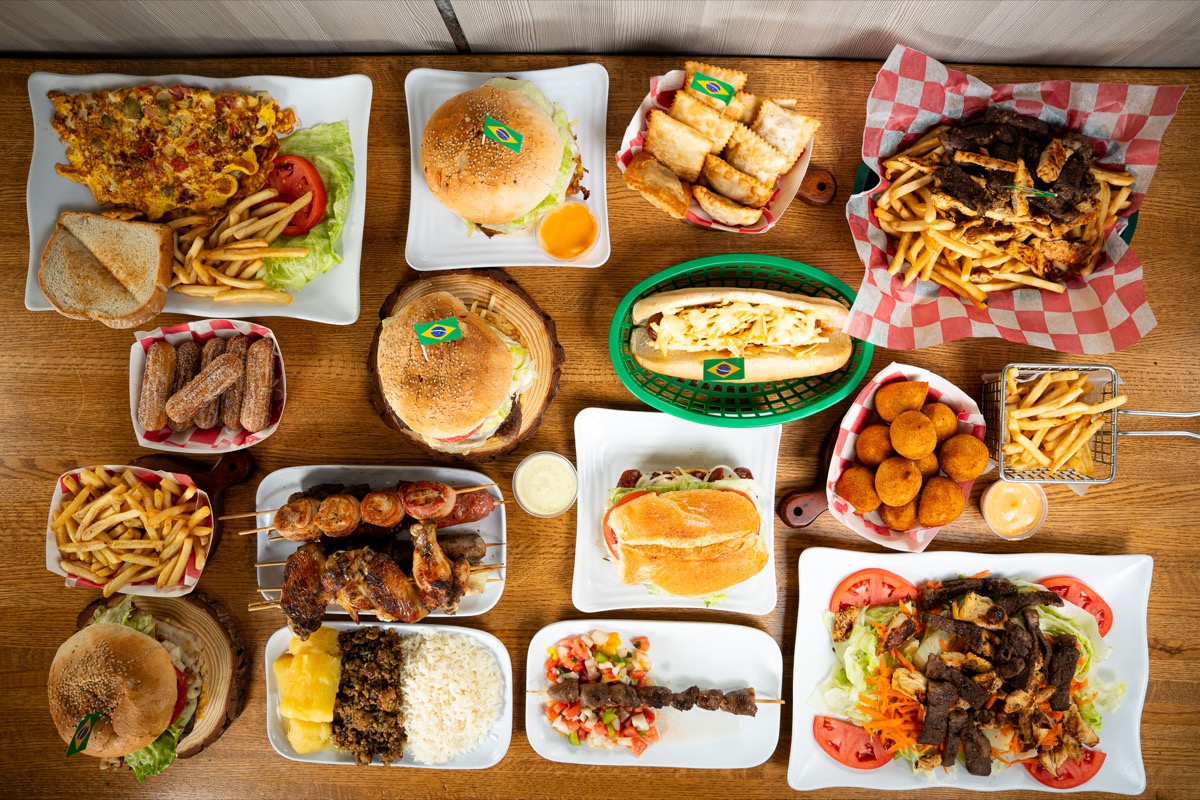
A table full of possibilities.
Food photography
Top Burger · Food photography by Mario Creative ·
View full image
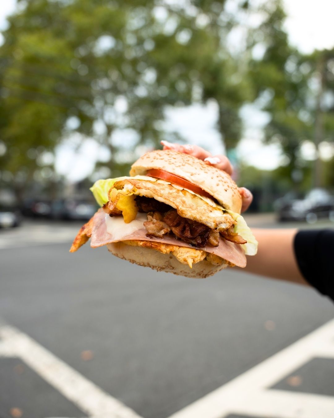
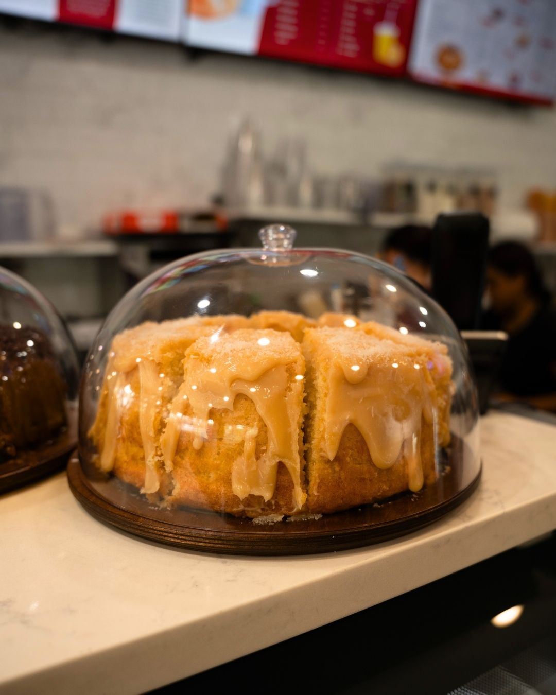
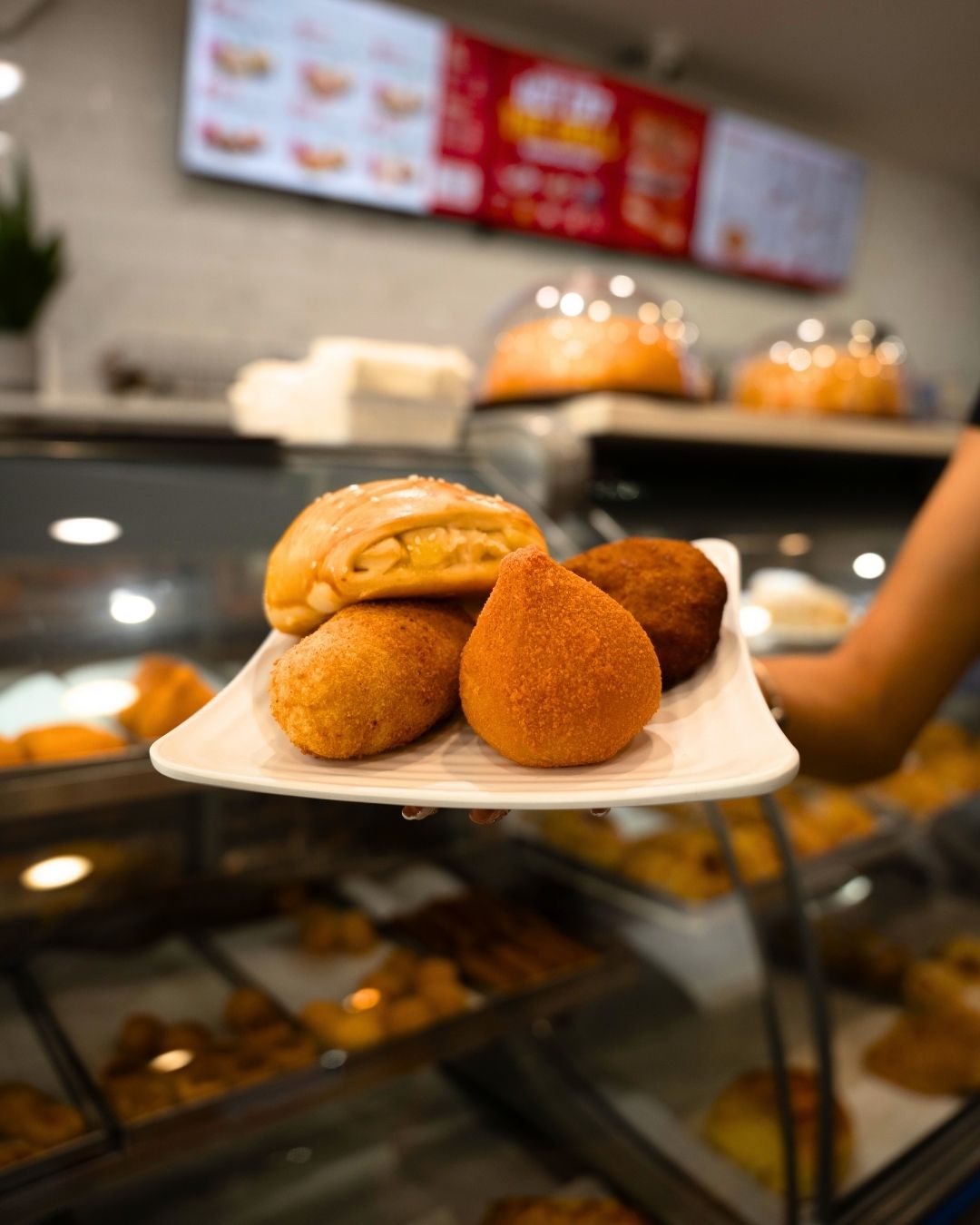
A burger in the neighborhoodSomething sweetBrazilian favorites
One brand. Across every format.
The scope
01
Website & checkout
A bold, simple website that turns product discovery into an easy
online ordering experience.
02
Product photography
Food imagery that brings the menu’s variety, textures, and
presentation into focus.
03
Branding
A shared visual direction across the website, social graphics,
television boards, and printed menu.
04
Social media content
Feed posts, videos, and custom Stories give the photography and
brand a consistent social presence.
See the content
From the table to the feed.
Explore Top Burger’s posts and videos on Instagram.